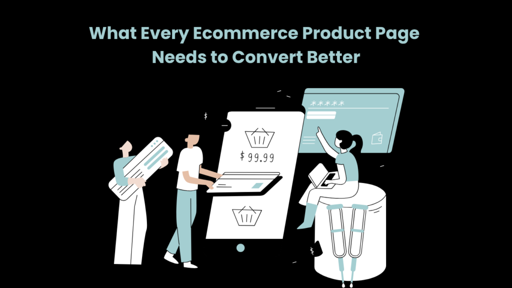
Here is a pattern that shows up constantly in ecommerce analytics: a store runs ads, gets traffic, watches visitors land on product pages, and then watches most of them leave without buying. The instinct is to blame the ads — wrong audience, wrong channel, wrong creative. Sometimes that is right. More often the problem is what happens after the click.
Product pages do most of the actual selling. They are also where most ecommerce stores underinvest.
The Questions a Visitor Is Trying to Answer
Someone on a product page is not browsing. They arrived at this specific page for a reason. What they are trying to establish, usually within a few seconds, is whether this is the product they were looking for, what it costs including delivery, whether the store is worth trusting, and what happens if they need to return it.
A page that answers these quickly converts. One that makes the visitor scroll to find the price, click a separate link for the return policy, or hunt through a paragraph of copy to find the material specifications adds friction at exactly the point where friction causes abandonment.
The first screen — what appears before any scrolling — should establish the product name, main image, price, at least one trust signal (a rating, a review count), and a visible route to purchase. If any of those are missing or unclear above the fold, a percentage of visitors will leave before seeing the rest of the page.
What Visitors Need to See
Online shoppers cannot hold the product, feel the material, or gauge its size against anything physical. The images on a product page are doing the work that a showroom or a physical store would normally do.
Strong visuals are especially important for products that customers cannot inspect in person, which is why many brands use 3d product rendering to show accurate colours, materials, angles, lifestyle scenes, and product variations before a purchase decision. When managing complex inventories across multiple channels, platforms like Catalogy can also help streamline how these digital product assets and variations are organized. For furniture, lighting, or home goods, a rendered lifestyle image showing the product at scale in a real-looking room answers questions that a studio photograph of the object alone cannot.
Beyond that: close-ups matter because surface quality — texture, finish, construction details — affects purchase confidence and is invisible from a distance. Scale references matter because “W120 x D80 x H75cm” does not help a visitor picture whether the table will fit. A product available in six finishes that is only photographed in one is asking the visitor to guess about everything they cannot see.
Copy That Actually Helps
The product description has a specific job: tell the visitor what they need to know to decide. It is not marketing real estate. It is not the place for claims about quality that every product listing makes.
Useful copy covers what the product is made of, who it is designed for, what the likely use cases are, and what a buyer should know before ordering. For furniture, that includes assembly requirements and care instructions. For clothing, how the sizing runs. For anything technical, compatibility information.
A long paragraph is harder to read than two short ones. A description that spends three sentences on brand values before mentioning what the product is made of has the priorities backwards. Most visitors skim; copy that cannot be skimmed effectively tends not to be read at all.
Specifications
Dimensions, materials, weight, colour options, warranty terms, package contents, delivery window — visitors look for these details actively, and they look for them fast. A specifications block in bullet or table format takes thirty seconds to scan. The same information buried in a third paragraph of the product description takes considerably longer to find, and some visitors will give up and leave rather than keep looking.
For products with multiple variants, the specifications should update when the visitor changes the selection. Someone switching between size options should not have to cross-reference a separate size guide to determine whether the dimensions have changed.
Trust
Hesitation before purchase is almost always about an unanswered question. The question might be about the store’s legitimacy, about whether the colour will match what the image shows, about what happens if the size is wrong.
Reviews answer the legitimacy question more effectively than any amount of copy about the brand. Customer photos answer the colour and real-life-appearance questions. A clearly stated return policy, positioned close to the purchase button rather than in a footer, answers the return question at the moment the visitor is deciding.
Secure payment icons and recognised payment methods contribute. None of them converts a hesitant visitor on their own. Together they reduce the specific doubts that add up to “I’ll think about it” and then never return.
Mobile
Large uncompressed images make pages load slowly on variable mobile connections. Slow pages get abandoned. This is straightforward and still frequently ignored.
Beyond load time: buttons that are too small to tap reliably, font sizes that require zooming, variant selectors that do not respond visibly when tapped, add-to-cart buttons that scroll off screen without staying sticky — these are all friction points that test well on a desktop preview and fail in daily mobile use. Resolving these deep-seated mobile UX issues cleanly often requires tailored Shopify development services to refactor core theme code rather than relying on bloated third-party apps.
The useful test is not running a speed check on a high-end device with a fast connection. It is loading the page on a mid-range phone on a mobile network and noting where the experience degrades.
Getting to Checkout
By the point where a visitor has looked at the images, read the description, checked the reviews, and confirmed the price, the decision has been made. The remaining job of the page is not to persuade — it is to not get in the way.
A visible add-to-cart button at that point in the scroll. A delivery estimate and total cost that appear before the visitor enters any payment information, not after. A guest checkout option that does not require account creation. A return policy that has already been seen.
Cart abandonment at the payment stage is usually about a surprise — a shipping cost that only appeared at checkout, a delivery estimate longer than expected, a requirement to create an account to complete the purchase. These are not UX problems. They are information problems, and they are solved by putting the information earlier in the page.
Read More: How Companies Are Cutting Logistics Costs with Real-Time Fleet Tracking
Product page checklist
- Product name, price, rating, and CTA visible without scrolling
- Multiple images including close-ups, lifestyle context, and scale reference
- All colour/finish variants shown visually, not just described
- Description covers materials, use cases, and practical buyer considerations
- Specifications in a scannable format (list or table)
- Reviews positioned near the purchase decision
- Return policy visible before checkout
- Mobile load time under three seconds on a mid-range device
- Add-to-cart button sticky or consistently visible on mobile
- Delivery estimate and total cost shown pre-checkout