Let’s be honest, when you think about branding, you’re most likely to picture logos.
That swoosh logo? It’s Nike. Saw Golden Arches? Must be McDonald’s. A half-eaten apple? You already know.
But here’s the catch: while logos are potent symbols, they are just one missing piece that completes the puzzle, brand identity. A lot of small business owners and entrepreneurs fall into the trap of thinking that once they have a logo, they have created a brand.
Spoiler alert: a logo isn’t your full brand. It’s more like the first friendly introduction to your audience. There is so much that goes on behind the scenes.
Let’s break down the logo vs brand identity comparison, what each does, how they work together, and why building a strong brand identity design is critical for long-term recognition and loyalty.
What a Logo Represents?

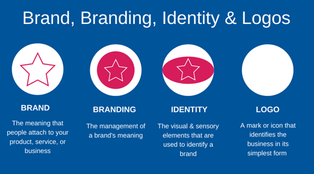
See, the above image clearly differentiates between a logo, brand, and identity. It clearly shows that a logo is a visual symbol that represents a brand in its most simplified form. Think of it as your brand’s signature, a quick visual shortcut for people to recognize you.
So, what exactly does a logo do?
- It helps people identify your brand quickly.
- It acts as a visual handshake for your audience.
- It captures the essence or concept of your brand in a simplified way.
For example:
- Nike’s swoosh represents speed, movement, and athleticism.
- Apple’s logo communicates simplicity, innovation, and elegance.
- FedEx’s logo, with the hidden arrow, reflects speed and precision.
These logos are brilliant, but here’s something important: they work so well because the brand identity design is strong, consistent, and memorable.
Think about it, without the context, a swoosh is just a line. But when paired with a brand strategy (“Just Do It”), it becomes visually appealing, connects emotionally, and symbolizes perseverance and performance.
In short, a logo isn’t your brand; it’s the first impression, the face of your brand.
What Brand Identity Includes (Colors, Tone, Imagery, Typography)
Your logo is just the face but brand identity is personality, voice, style, and vibe it creates.
It’s a complete system of visual and emotional elements that work together to communicate what your brand stands for.
A brand identity typically includes:
- Color Palette
Simply, colors evoke emotions. Red can mean excitement (Coca-Cola), blue evokes trust (PayPal), and green represents sustainability (Starbucks). - Typography (Fonts)
Fonts reflect the personality of your brand. Sleek sans-serif fonts give a modern, minimal (Google) vibe, while serif fonts often indicate tradition or elegance (like The New York Times). - Imagery & Photography Style
Are your visuals bold and edgy (like Red Bull), soft and calming (like Dove), or luxurious and polished (like Chanel)? - Tone of Voice
Is your brand voice playful and quirky (Old Spice), empowering and bold (Nike), or calm and caring (Headspace)? - Brand Story & Mission
What do you stand for? What problem are you solving? What values are you pushing forward? - Design Elements & Layouts
Patterns, iconography, buttons, packaging style, they all contribute to how your brand feels.
Brand identity design is about shaping how people feel when they interact with your business. Whether it’s when they visit your website, open your app, scroll through your Instagram, or unbox your product, the experience should feel surreal to make a lasting impression.
That emotional connection? That’s created through branding strategy, not just a logo.
How Logo and Brand Identity Work Together?
A logo and brand identity are not different from one another. They should be aligned to create a professional brand impression.
Think of it like this:
- A logo introduces you.
- A brand identity design tells your story and builds trust.
When customers consistently see the same colors, fonts, tone, and visuals tied to your logo across different touchpoints, they start recognizing it.
Here’s how they work:
| Element | What It Does | Example |
| Logo | Symbol for recognition | Nike swoosh |
| Colors | Evoke emotions & reinforce memory | Tiffany blue |
| Typography | Supports personality | Vogue’s luxurious serif font |
| Tone | Builds connection | Wendy’s witty tweets |
| Imagery | Sets visual mood | Airbnb’s warm lifestyle photos |
Opt for logo design services: If you’re looking for a logo that appears on a website, packaging, or ad that matches your identity, customers feel connected. Consistency creates familiarity, and the more familiar your audience is with your brand, the more likely they’ll trust it.
Examples of Brands with Strong Identities Beyond Their Logos
To really understand the logo vs brand identity, you need to examine top brands. Let’s take a look at how some iconic brands’ strength lies in their overall identity, not just their logos.
1. Coca-Cola
Coca-Cola’s script logo is iconic, sure, but what really drives their brand is their identity built on happiness, sharing, and nostalgia. Their signature color red, their friendly tone (“Open Happiness”), and their emotional storytelling make people feel something before they even see the logo.
2. Starbucks
The green siren logo is recognizable, but the true identity lies in the cozy atmosphere, earthy tones, warm lighting, consistent cup designs, and their language (tall, grande, venti). They’ve built a lifestyle, not just a drink.
3. Apple
Apple’s logo is minimal, but it reflects the whole brand identity. The sleek design, innovation, and simplicity make it a high-end visual. Furthermore, the minimalistic white space and emotionally driven campaigns like “Think Different” make a real difference.
4. IKEA
The simple blue and yellow block logo is nothing without the experience: easy-to-assemble furniture, Scandinavian minimalism, approachable tone, and even the in-store journey and meatballs experience.
These brands have powerful logos, yes, because they have a branding strategy that makes them unforgettable.
Read More: 9 Best Ways to Ask for Customer Reviews and Testimonials in 2025
In a Nutshell
So, is a logo important? Absolutely.
But is a logo enough to define your brand? Absolutely not.
Your logo serves as a memorable symbol, but your brand identity is what brings meaning, emotion, and connection to that symbol. It’s the difference between someone recognizing you and someone remembering you. If you’re looking to create a logo that makes heads turn, then it’s high time you get in touch with a logo designing company in Dubai. Why? Because Dubai captures the whole market, you definitely don’t want to miss out on your target audience.
So, it’s a verdict! To build a brand, you should:
- Start with a logo, but don’t stop there.
- Develop a clear identity with colors, voice, fonts, imagery, and messaging.
- Be consistent across every platform and experience.
- Create emotion, not just visuals.
Because in the end, a logo gets you noticed, but a brand identity gets you chosen.


